Designing the X-Plane 11 User Interface
[This post was co-authored with Tyler Young of Laminar Research to provide more insight into the design process for X-Plane 11, and cross-posted on the Blind Pig blog.]
A few years ago, we ran a survey of X-Plane users. One of the questions was: If you could improve one area of X-Plane, what would it be?
The most common response was, overwhelmingly… the flight model (cue rimshot). Yeah, right. Of course the number one response was the user interface. We took that criticism seriously, but we didn’t want to incrementally improve the user interface and the experience of using X-Plane when improvements were needed throughout the entire application.
So instead, we decided to redesign the user interface from the ground up. Now, two and a half years later, we can finally talk about it!
Back to Basics
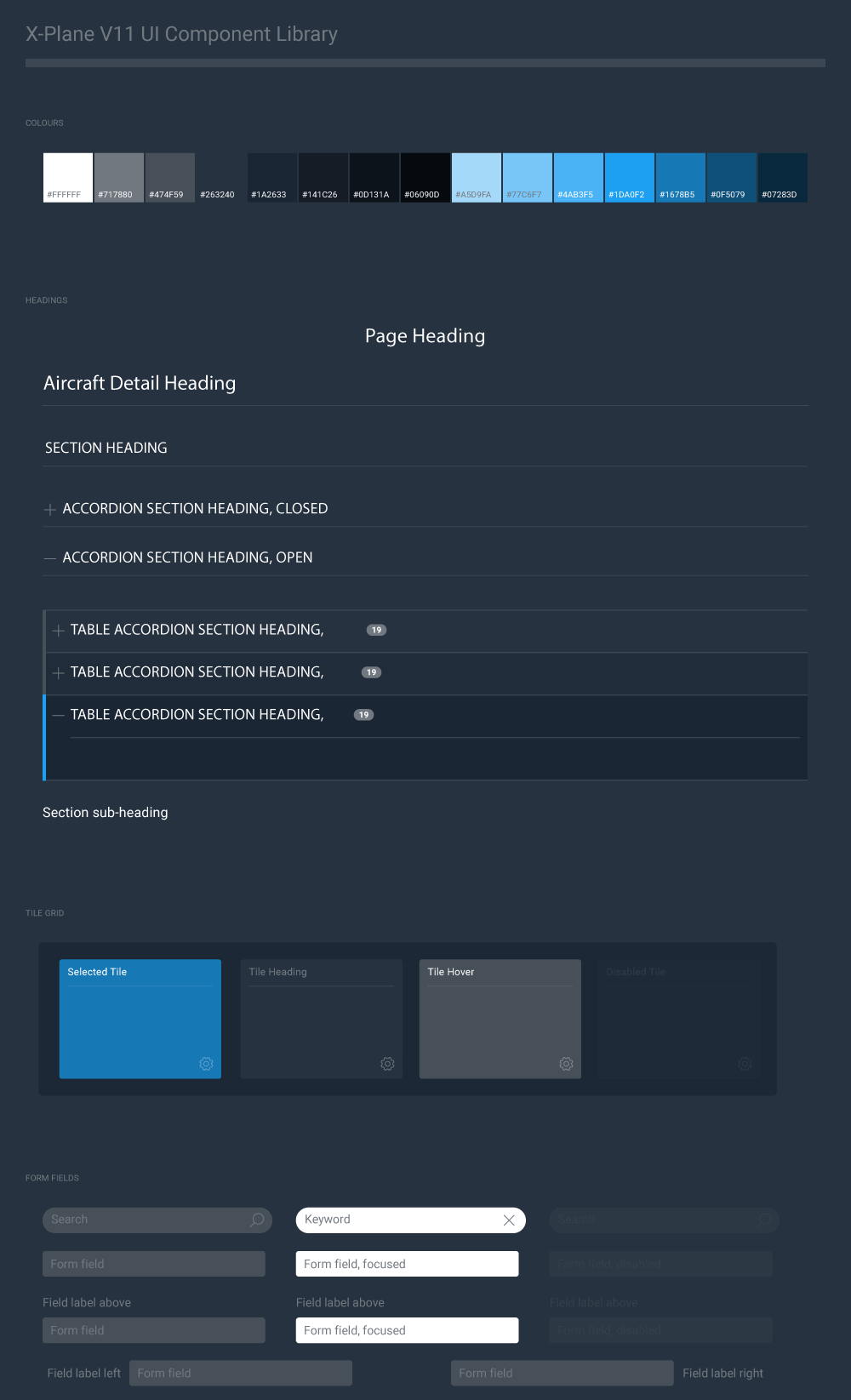
Unless a strong brand is already established, I like to start with typography on most projects like this. Font weights, text colour, letter spacing and line height are carefully considered for each typeface option. And the results are always viewed on screen since that is where users will be experiencing the product. Often when going through this exercise, I frequently find a font family I think will work for the interface, only to discover its legibility is less than ideal. We explored several font families and decided on Roboto. It offered a comfortable reading experience for UI elements and the ability to easily extend the brand online. An updated colour palette was also developed for X-Plane 11. I tend towards monochromatic colour schemes with gradations of each colour filling out the palette. I started with the blue value from previous versions of X-Plane but created a darker overall scheme to use.
All of this was collected into a Component Library. This made extending the interface fast and easy and provided a consistent point of reference for UI elements.
Let’s Get Visual
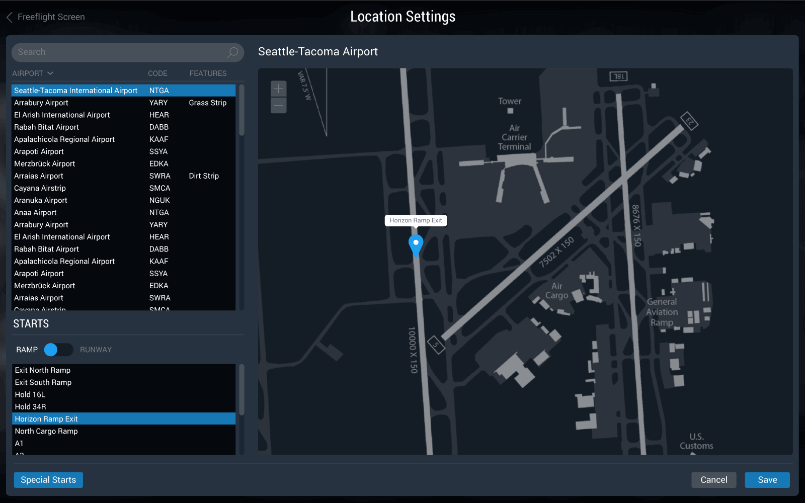
For X-Plane 11, we wanted to make everything as visual as possible—long, condensed lists of aircraft, airports and settings were dropped in favour of tiles, maps and ‘wizard-type’ user flows. Previously, if you wanted to pick where you were going to start at an airport, you had to navigate through a long text list of runways and ramps; now you can use the visual location picker and just click on the map.
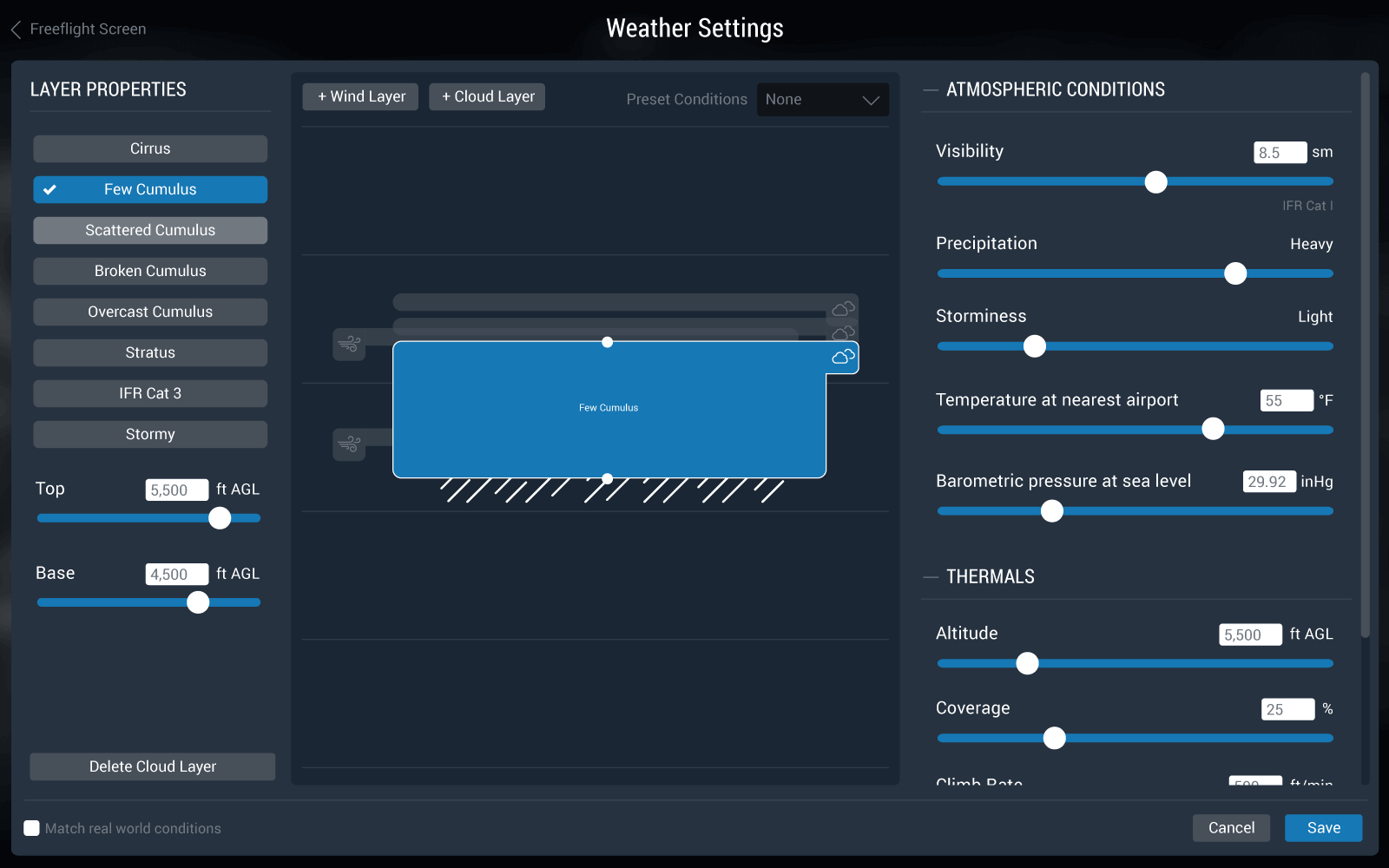
For weather, there’s no more text descriptions of cloud and wind layer heights; just click and drag! You also get visual indicators of precipitation, and real weather gives you a preview that looks exactly the same.
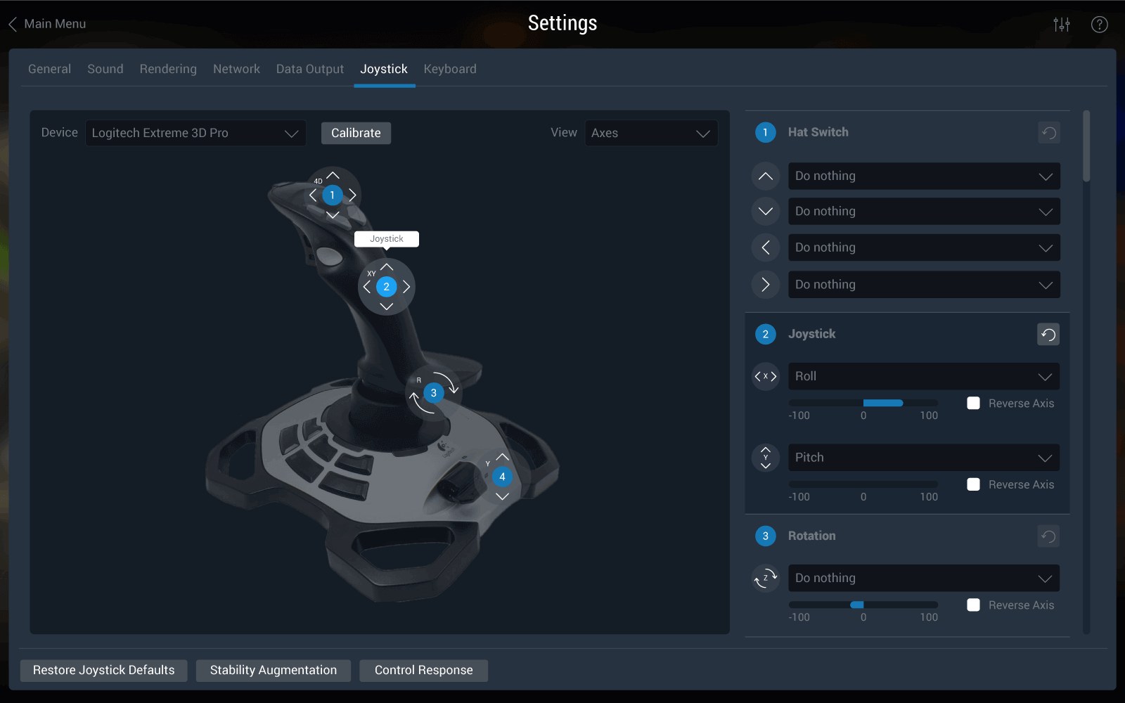
Under the settings screens, joystick configuration has been vastly improved. We’ve worked hard to provide a comprehensive list of interactive images of your hardware, so you don’t just have a text list of buttons that don’t mean anything.
Filters, Search and Settings
In some cases, there’s no avoiding text lists. X-Plane is a very comprehensive and powerful flight simulator, and as such, there’s an incredible amount of configuration that needs to take place before taking flight. For version 11, all text-based selections support filters and/or search. Gone are the folder views and unmanageably long text lists; instead, users can now filter along all sorts of dimensions.
Ready for Takeoff
Overall, I was extremely happy with the re-design process—I really enjoyed working with the team at Laminar Research and we feel we really improved the user experience on X-Plane 11. But what matters most is what you think. So far, initial reviews are positive—if you’ve tried it out, please let us know your thoughts.